
Get to know the Google Sheets Chart editor sidebar. The Chart editor sidebar is a pane that organizes chart editing options using collapsible sections. The sidebar allows the chart style, chart and axis titles, series, legend, horizontal axis, vertical axis, and gridlines to be customized. The pane displays different choices depending on chart type.
When customizing a column chart there are 7 sections:

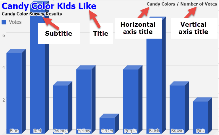
Discover the features available for each section. Explore the Chart editor sidebar to gain an understanding of the parts of the column chart you can customize.
Customize a Column Chart
- Add data to Google sheets. Create a column chart.
- To display the Chart editor sidebar, double click the graph.
- Click CUSTOMIZE from the Chart editor sidebar.
Chart Style
Chart style is the appearance of the chart area. It includes the font used for text, background color of the area behind the graph, size of chart, and the style of the columns. When customizing these options, select an easy to read font. In addition, be certain to pick a background color that makes the columns stand out.
- Set the chart style:
- Click the Chart style arrow to display the options.
- Set the color of the chart area. Click Background color. Pick an option.
- Apply a style. Check Maximize to fill the chart area or 3D to have the chart bars look three-dimensional.
- Select a Font for the text on the chart.

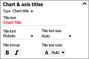
Chart & Axis Titles
Chart and axis titles provide essential information about the data in the graph. The words in the titles can be edited to improve clarity. As well, the font, size, style, and color can be customized to make the text easy to read.
- Set the chart title:
- Click the Chart & axis titles arrow.
- Click the Type arrow, select Chart title.
- In the Title text box, type Chart Title.
- Customize the appearance of the title. Select a font, font size, format ,
and text color .
- To add a chart subtitle, horizontal axis title, or vertical axis title click the Type arrow and make a selection.
Series
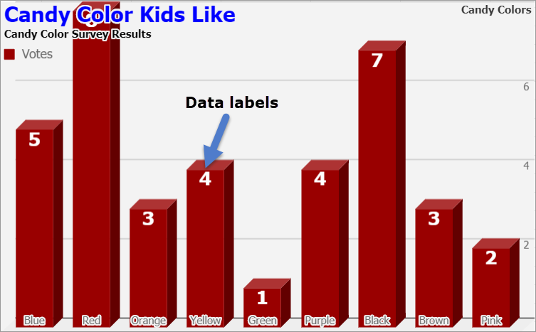
A data series is a row or column of numbers in a worksheet. In a column chart, the series is shown as a set of vertical bars. A simple graph will have one data series, whereas a comparison chart will have two or more data series. The color of the data series can be changed to alter the appearance of the columns. As well, error bars can be applied to the column chart if the graph displays statistical information. Another option is to overlay data labels to identify the value or percentage of each vertical bar, which makes the information easy to understand. As well, a trendline can be applied if the data will be used to study trends or forecast a future value. Pick the options that suit the purpose of your graph.
- Format the series:
- Click the Series arrow.
- Click the Apply to arrow. Select a data series.
- Click Color . Pick an option to set the color of the bars.
- Select Left axis or Right axis to move the axis labels.
- If the chart displays statistical data you may want to select Error bars and then adjust the settings.
- To show values on each bar, check Data labels.
- To display a trend or forecast future data, check Trendline and then adjust the settings.

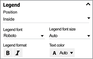
Legend
A legend is a key used to identify the information in a graph. Each data series in a graph has a color. The legend explains what the color represents. If a column chart has one data series, then the legend may not be necessary. However, if there is more than one data series in a graph then the legend should be included.

- Position the legend:
- Click the Legend arrow.
- Select a position. Refer to the tips:
- None hides the legend.
- If Maximize was selected as a Chart style option, then most positions will be unavailable.
- Select a font, size, format , and text color for the text in the legend.
Horizontal Axis
The horizontal axis labels are at the bottom of the column chart and are used to identify the data shown in each vertical bar. The font, size, format, and color of labels can be customized. In addition, the data in the graph can be reversed. Moreover, the labels can be slanted. However, if Maximize was selected as a Chart style option, than the labels will not display on a slant.

- Format the horizontal axis labels:
- Click the Horizontal axis arrow.
- Format the font, font size, format font style , and text color .
- To switch the sequence of the vertical bars in the column chart, select Reverse axis order.
- Click Slant labels and select an angle to change the orientation of the text.

Vertical Axis
The vertical axis labels are at the side of the column chart and are used to identify the value each bar represents. The font, size, format, and color of the label can be customized. In addition, the scale used to display the data can be adjusted.

- Format the vertical axis labels:
- Click the Vertical axis or Right vertical axis arrow.
- Format the font, font size, format font style , and text color .
- Typically the minimum value is zero. Set a higher minimum value in the Min box if you want to only display bars that are greater than zero.
- Typically the maximum value is the greatest data value included in the column chart. Set a higher maximum value in the Max box if you want to add space above the tallest vertical bar on the graph.

Gridlines
The gridlines are horizontal lines in the plot area. They act as a guide for identifying the value of each vertical bar. The amount, position, color, and type of gridlines can be set.
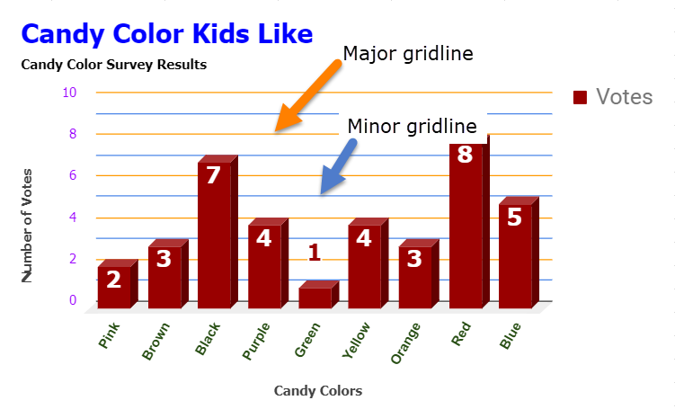
- Format the gridlines:
- Click the Gridlines arrow.
- Select Vertical axis or Right vertical axis from the Apply to box.
- Pick a number for the Major gridline count.
- Set the Major gridline color. Click Major gridline color. Pick an option.
- Pick a number for the Minor gridline count.
- Set the Minor gridline color. Click Major gridline color. Pick an option.

Activities that Use the Chart Editor Sidebar
Do you want to teach graphing to your students using Google Sheets? TechnoKids has many projects for integrating spreadsheets into curriculum. Increase candy sales with TechnoCandy. Launch a business venture in TechnoRestaurateur. Develop a budget for a shopping spree in TechnoBudget. Analyze data in TechnoQuestionnaire.